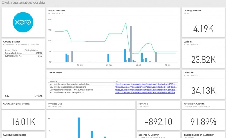
Last week Xero added its first enterprise-grade app, the business intelligence tool Microsoft Power BI.
Power BI is notable for a couple of reasons; it is hugely powerful, it looks a lot like Excel, and it’s free. In fact, one writer described Power BI as “the future of Excel”. “Excel isn't going away, but it's going to stop accumulating extra tools like barnacles. Instead Power BI Desktop will become the self-service analytics hub,” wrote Mary Branscombe in CIO.
Where analytics in Excel requires the use of four tools – Power Query to colllect and clean data, Power Pivot to analyse it and Power Map and Power View to visualise it – Power BI does it in one powerful, easy-to-use interface.
Xero’s free integration gives Xero users the ability to create reports with pre-configured information and graphs, to customise those reports and to write their own. Power BI graphs can also be shared very easily (compared to Excel) by embedding them in websites, blogs or Powerpoint slides, or printed.
Power BI is a strong data analytics platform which pulls data from other systems through connectors it calls “content packs”. The Power BI gallery lists 59 content packs, ranging from traditional data services like Access and SQL database through to cloud services like Facebook, Mailchimp and Stripe.
In this article we look in detail at how to use Power BI with Xero.
Setting up Power BI
Access to Power BI is available as a cloud app or a desktop program via https://powerbi.microsoft.com/en-us/. The cloud based Power BI service is all that’s required. The only catch in the signup process is that you’ll need to enter a custom domain named email address (e.g. @mycompany.com).
Power BI does not support the use of ‘mass’ email domains, including @outlook.com, @gmail.com and many ISP provided email domains.
Office 365 users can use their account to sign up to Power BI. Power BI will then become part of your Office 365 dashboard, with the top corner app launcher switching between Power BI, your email account, OneDrive and Sharepoint.
Once you’re signed into Power BI, the Xero content pack is quite easy to find. Look under the big yellow ‘Get Data’ button then search the Services gallery. The setup will walk you through adding your Xero credentials and selecting your organisation.
You can repeat this process for every Xero organisation your Xero login has access to. It’s important to note that the connector will only have access to the information in Xero that this Xero login can access. That’s useful if you wish to set up dashboards relating to sales for a staff member with the Xero Sales Only role.
Dashboards, Reports and Datasets
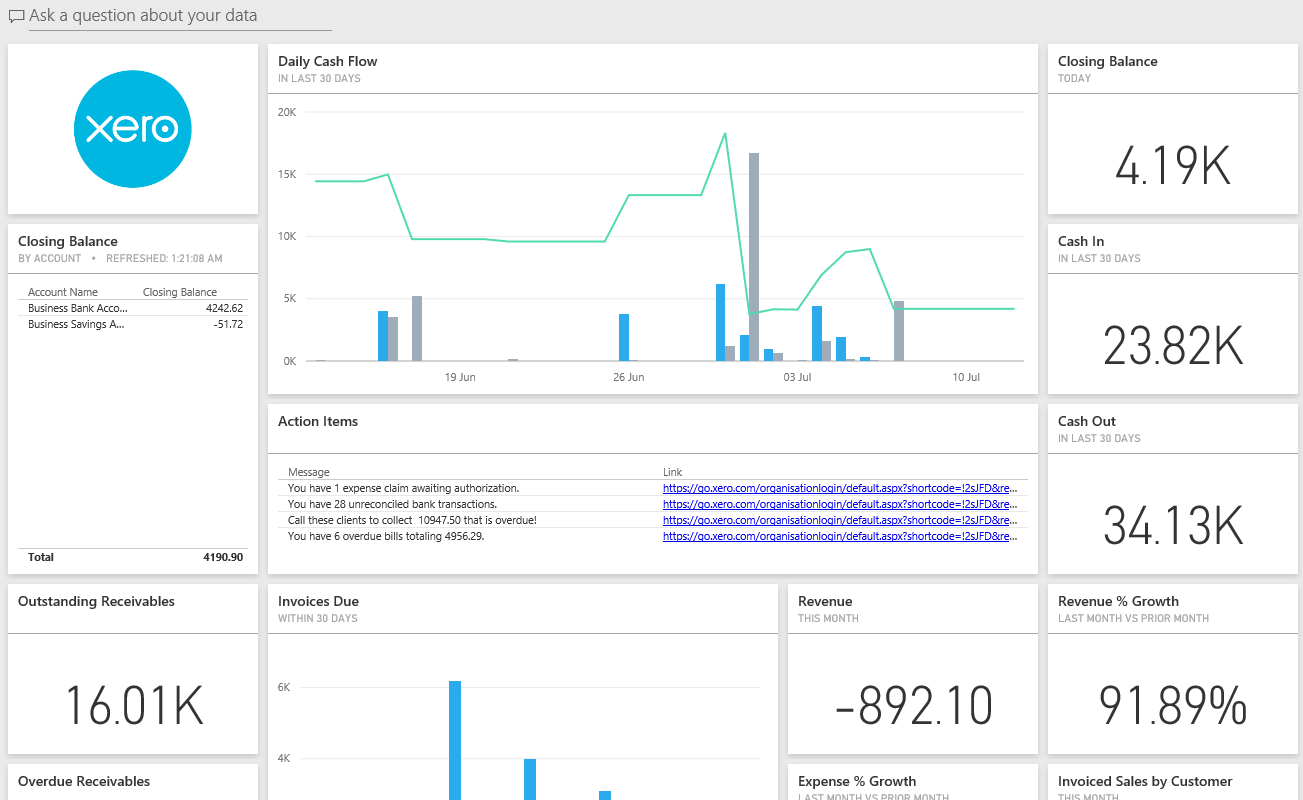
After a few minutes your Xero data will show up under three main headings: Dashboards, Reports and Datasets.
Your Xero Dashboard comes pre-populated with 30 tiles, shown as graphs, lists or numbers. The tiles can be moved, resized or deleted. Clicking on any tile opens the report where the information is obtained from.
In the report you can then edit the tile contents including changing the graph type or data. The main dashboard itself has a ‘three dots’ open menu button at the top right hand corner that you can then click to Duplicate the dashboard.
This is handy if you want to preserve this full layout and give yourself another canvas to customise.
The list of pre-configured Dashboard items:
- Daily Cash Flow (Graph - Last 30 days)
- Closing Balance (List - By Account)
- Action Items (List - Links)
- Closing Balance (Figure - Today)
- Cash In (Figure - In Last 30 days)
- Cash Out (Figure - In Last 30 Days)
- Outstanding Receivables (Figure)
- Overdue Receivables (Figure)
- Invoices Due (Graph - Within 30 days)
- Revenue % Growth (Figure - Last month vs prior month)
- Revenue (Figure - This month)
- Invoiced Sales by Customer (Graph - This month)
- Outstanding Payables (Figure)
- Overdue Payables (Figure)
- Bills Due (Graph - Within 30 days)
- Expense & Growth (Figure - Last month vs prior month)
- Expenses (Figure - This month)
- Billed purchases by Supplier (Graph - This month)
- Monthly Sales (Graph - By product)
- Net Profit (Figure - This fiscal year)
- Net Profit (Figure - This month)
- Monthly Profit & Loss (Graph - Monthly sales and monthly expenses)
- Top Expense Accounts (Graph - This fiscal year)
- Total Assets (Figure)
- Total Liabilities (Figure)
- Equity (Figure)
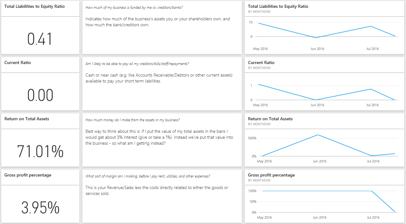
- Total Liabilities to Equity Ratio (Figure, explanation and Graph - By month end)
- Current Ratio (Figure, explanation and Graph - By month end)
- Return on total assets (Figure, explanation and Graph - By month end)
- Gross profit percentage (Figure, explanation and Graph - By month end)
At first glance, that’s a significant amount of information on one screen, but surprisingly they layout isn’t cluttered. Figures like Cash In and Outstanding Receivables are bold. Performance indicators like Gross profit percentage and Revenue % growth are a nice addition to raw data.
The Action Items tile lists the number of unreconciled transactions, client overdue invoices and outstanding payables, with links to the relevant Xero web pages.
The Reports section is even more detailed, with information grouped into tabs:
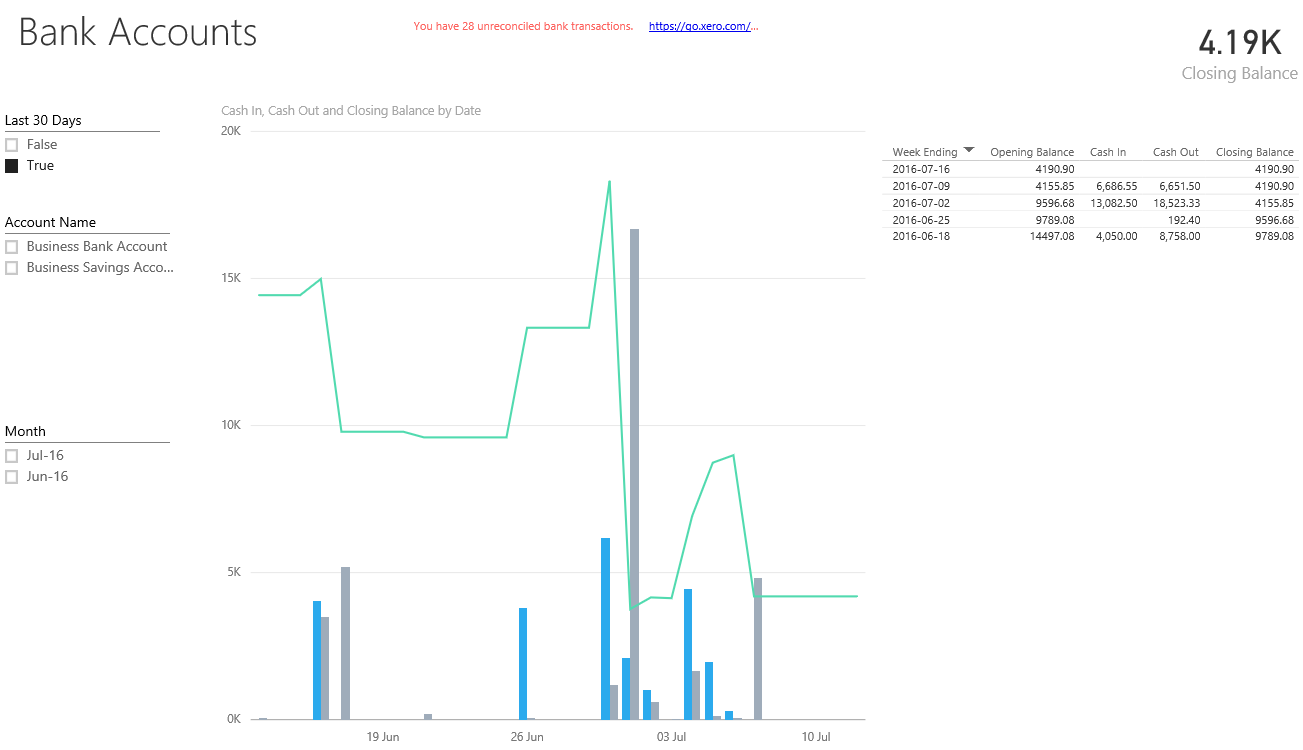
- Cash – Bank Accounts, Cash in, Cash Out, Closing Balances
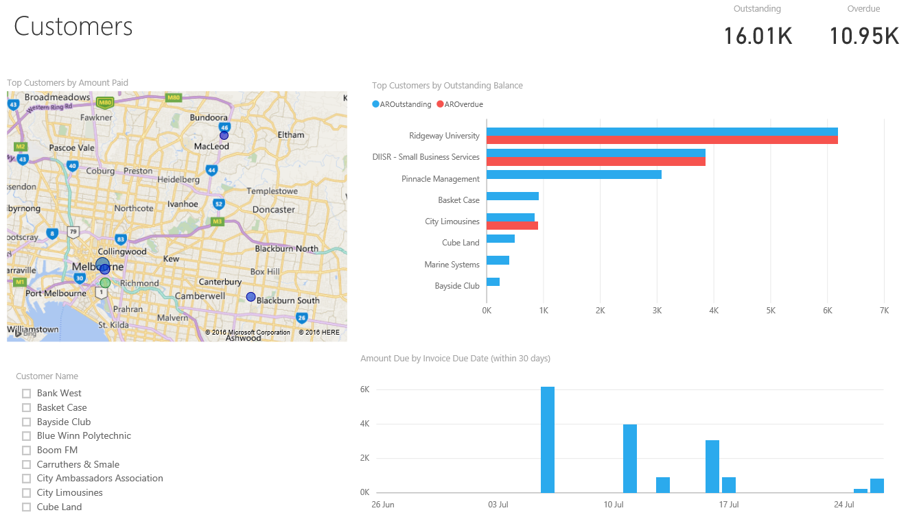
- Customers – Top customers, Outstanding balances, Amount due by due date
- Suppliers – Top suppliers, Outstanding balances, Amount due by due date
- Inventory – Sales % growth, Units purchased, Monthly sales by item
- Balance Sheet – Balance sheet accounts and amounts (assets, equity, liabilities)
- Profit & Loss – Profit & Loss, Sales versus expenses by month, Top expense accounts
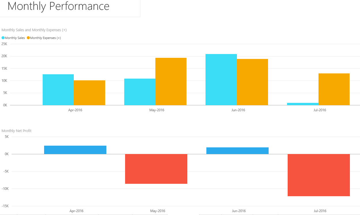
- Performance – Monthly sales and monthly expenses, Monthly net profit
- Health – Current ratio, Total liabilities to equity ratio, Gross profit percentage, Return on total assets
- Action Items – Outstanding items to be actioned in Xero, with links
- Glossary – Explanation of health graph and data set limits.
Tiles in the report can be edited, filtered and pinned to dashboards and entire tabs can be deleted. Again, the report can be duplicated so you can preserve the full set of information while you customise a copy. The tile contents are responsive to displaying labels on mouse over or changing what is displayed based on tick boxes. It’s important to note that these don’t include Payroll or Tax items.
In the Datasets section you can go wild building your own reports and visualisations. You’ll only have access to the fields that are supported by the content pack, but there are 161 of them. Here you could add PAYG Withholdings Payable, for example, and pin it to your dashboard.
An alternative to the dataset report builder is the Q&A feature. Located at the top of your dashboard, this ‘Ask a question about your data’ search box is designed to be more of a natural language query.
It will suggest some search terms such as ‘sales MTD’ and you can add your own (in the dashboard settings).
The search terms take some getting used to. They’ll pop up some suggestions as you type, but you still have to be careful with your selection of words and sentence structure. For example, ‘compare sales YTD 2 yrs’ will give you a two bar sales YTD comparison graph whereas ‘sales ytd this year compared to last year’ will give you something different.
Related Insights
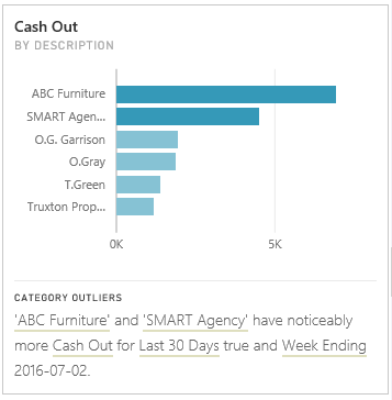
Two useful features of Power BI are worth exploring. On any dashboard tile, click on the ‘three dots’ open menu icon to see a sub menu of icons. Click on the lightbulb and Power BI will search your data for insights related to the set of information.
As well as showing additional graphs, the Related Insights feature will highlight trends such as suppliers that you’ve spent noticeably more at than others in the last 30 days.
Not all insights are this great. We weren’t surprised to find that ‘Business bank account accounts for the majority of Cash In for Last 30 Days’.
From the three dots open menu next to your dataset, you can run Quick Insights across the entire organisation.
Web-based sharing
Hiding under the File menu in the Reports section is Publish to Web. Here you can grab a link to send via email or an HTML embed code. That embed code could be on your company intranet page, showing everyone the performance of your widget sales, or showing account managers the receivables of their clients, without them needing to have access to Xero or to Power BI.
That’s a ‘semi live’ link too – it will display the current information but changes to the report structure itself could be delayed by up to one hour.
Data limitations
Power BI free will refresh data from Xero each night, so by default you are looking at yesterday’s figures. Remember to take into account any other integrations that feed into your Xero company files and when they might update Xero.
The Xero API allows for a maximum of eight data refreshes in a 24 hour period, so you can manually choose Refresh Now next to your dataset to force an update.
All data is retrieved for all history except Trial Balance data, which is limited to the last 24 months. And line item detail for invoices is limited to the last 12 months or the last 1,200 invoices.
Go mobile
Power BI has mobile apps that can be downloaded for iOS, Android or Windows 10 mobile. The functionality is more limited but if you’ve done the hard work in a full browser the mobile apps give you quick access to check information or to show it off during a meeting over coffee.
The Verdict
Bringing financial data to life is a good thing and there already a number of third-party integrators such as Crunchboards, Fathom and Spotlight Reporting. Microsoft’s Power BI does have the advantage of being free, though this limits you to support via the community forums and email during the US daytime. You can also pay for priority support.
Considering the price, the amount of well-presented data and deep report building options are pretty impressive. The dashboards and reports clearly highlight the health of a business and provide immediate conversation starters for accountants and bookkeepers looking to provide proactive advice.
Add to that the ability to switch between Xero organisations and you have a powerful new tool for managing a range of customers.
It will also take some getting used to though. There is immediate value out of the box but building your own reports will take a little time, some data/business analyst skills and patience. Power BI is an immensely powerful tool, so don’t expect the ease of other reporting tools. But then again, did we mention it’s free?
Microsoft has some self-guided learning; you’ll want to focus on the sections covering Visualizations and Exploring Data. Sometimes the learning scenarios are based on the Desktop version or Excel, which isn’t relevant.
The value in data still lies in its interpretation and recommending actions. Pretty graphs don’t help you understand why something is trending high or low. That said, Power BI will save you from generating individual reports to view the health of each client’s business.
The prospect of business owners getting their hands on this data is both exciting and terrifying. While they already have access to the data in Xero, figures like Liabilities to Equity ratio and Return on Total Assets are easily viewable and can be misleading if not understood correctly.
The option to selectively publish this information though is very interesting. Set up correctly, business owners can email a web link to a sales rep so they can view the sales figures across their customers.
In the accounts department, a staff member could see the accounts receivable without having to log into Xero, if say their only role was to chase debtors.
This sharing of segregated data is controlled by what you add to the report that you share, adding a level of detail that Xero’s roles don’t have.
Accountants and bookkeepers can also publish customised reports to their clients, highlighting the numbers that are important to them. This increases the value of your advisor relationship and lets the business owner prepare for your upcoming phone call.
Ultimately, you need to review the Xero data in Power BI and make the decision for yourself. The ease of spotting issues across multiple clients may make it worth investing the time in this free product.
It’s unlikely to put the third-party reporting integrators out of a job, but you need to decide where you draw the reporting line. Will this give you 95 percent of what you need for free, or are the paid solutions just too easy and too flexible to give up? Is there a place for both in your firm?
The winners from this announcement will be the partners who adopt Power BI into their business processes. It won’t benefit you or your clients if the data sits on a dashboard without ever being reviewed.
Leave a comment and tell us if you think Power BI will help you deliver a more informed, proactive service to your clients.
Correction: An earlier version of this article stated that Xero was the first of the small business cloud accounting vendors to integrate with Microsoft Power BI. Intuit QuickBooks Online went live with its integration in May.


